We developed the strategy and identity for Sable & Co, a premium real estate brand in Dubai. The challenge was to establish trust in a crowded market while giving the brand enough character to feel genuinely different.
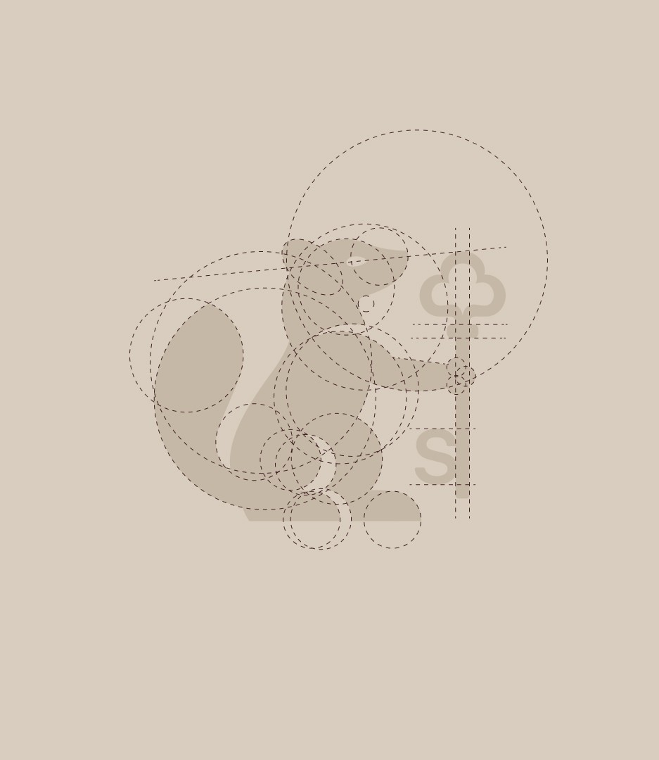
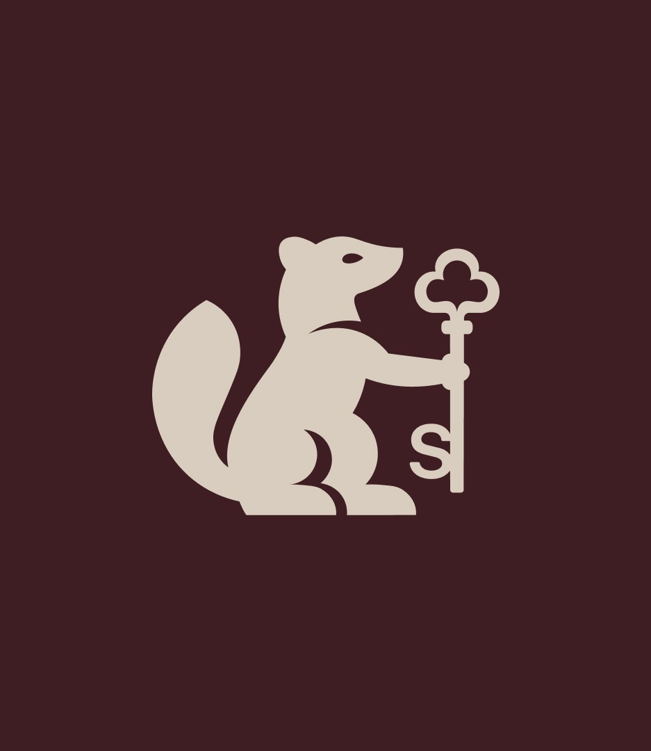
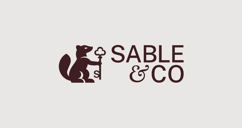
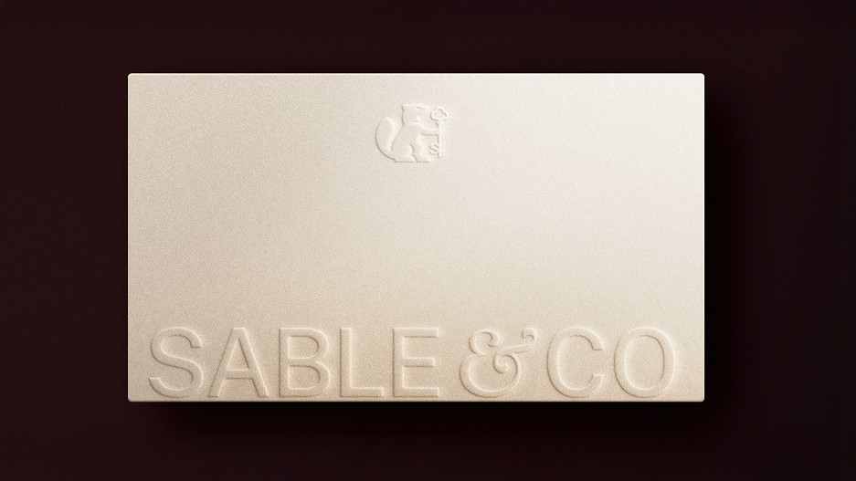
The name and pictorial mark were designed to feel familiar and enduring. By drawing on the visual language of heritage, we gave Sable & Co a sense of stability without relying on the usual symbols of luxury real estate.
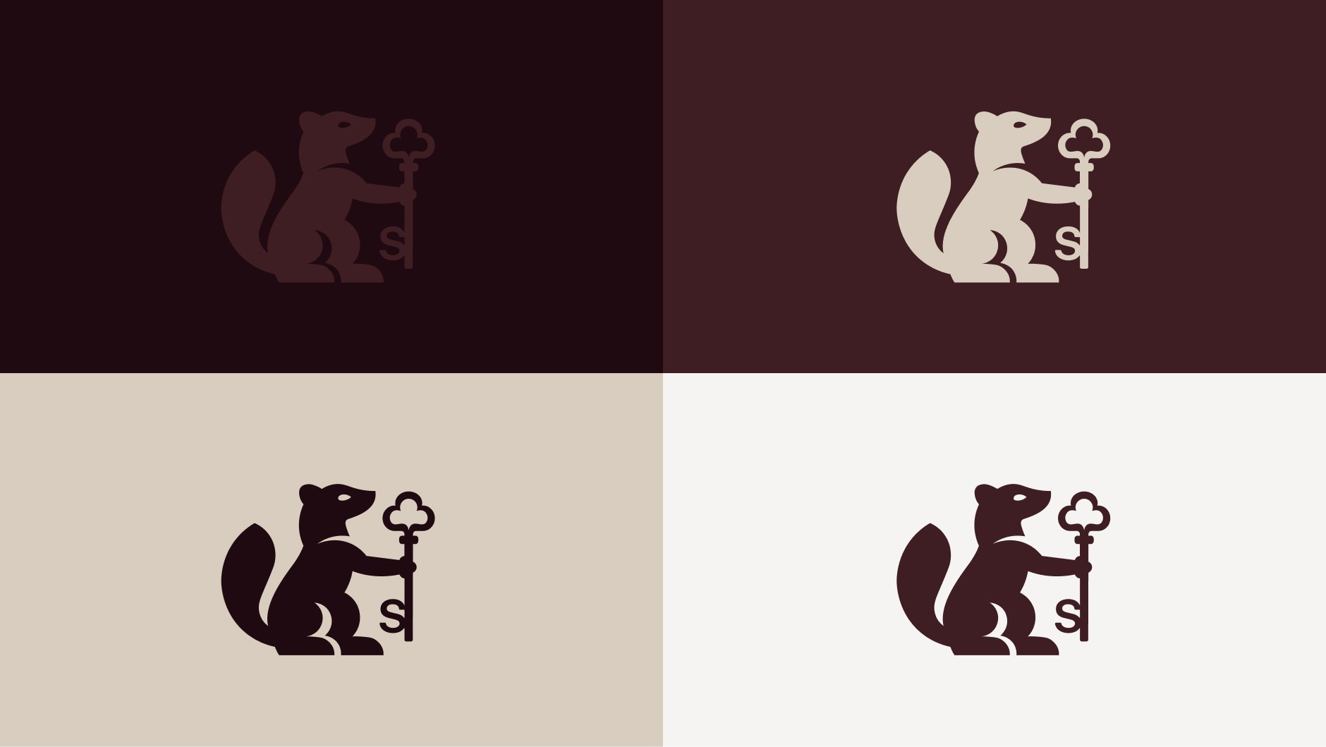
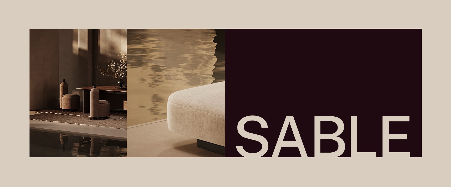
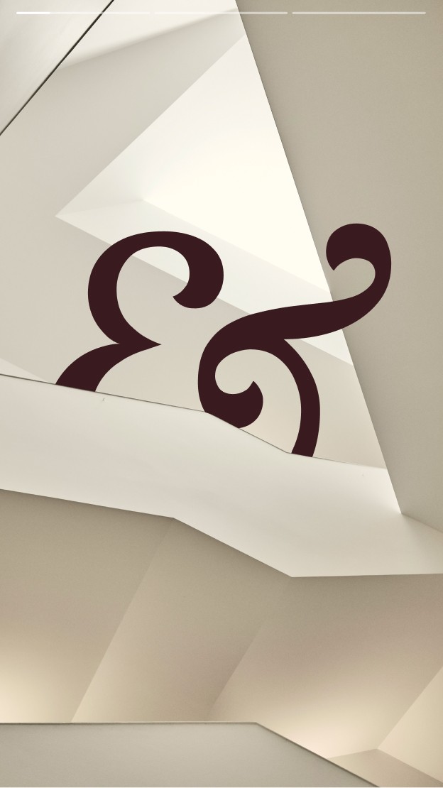
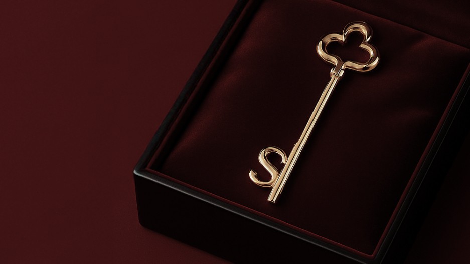
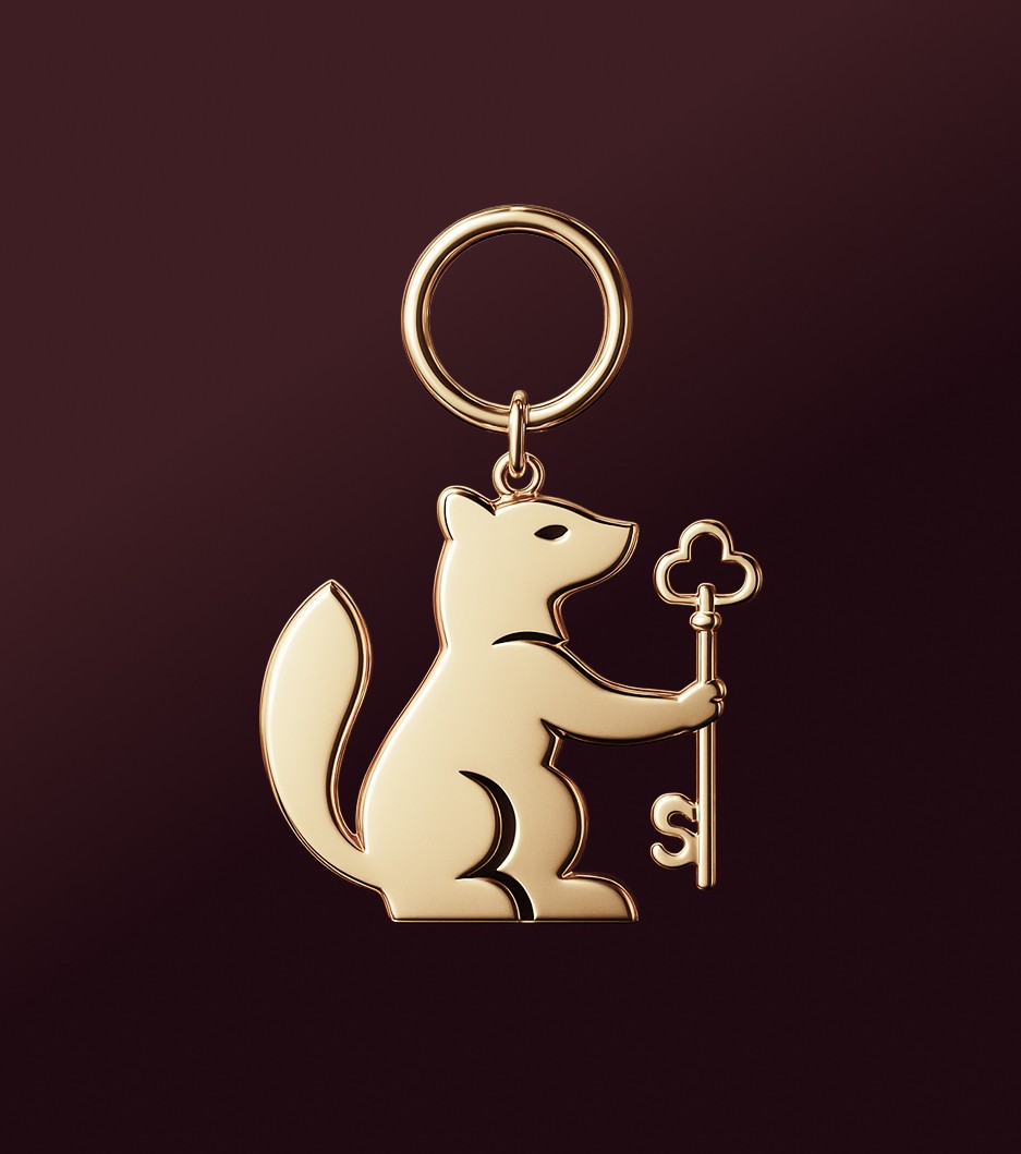
We built a flexible logo family around the sable, the key and the ampersand. Each can take the lead or play a supporting role, creating a visual language that feels modern and quietly playful. A restrained colour palette keeps it grounded in luxury.
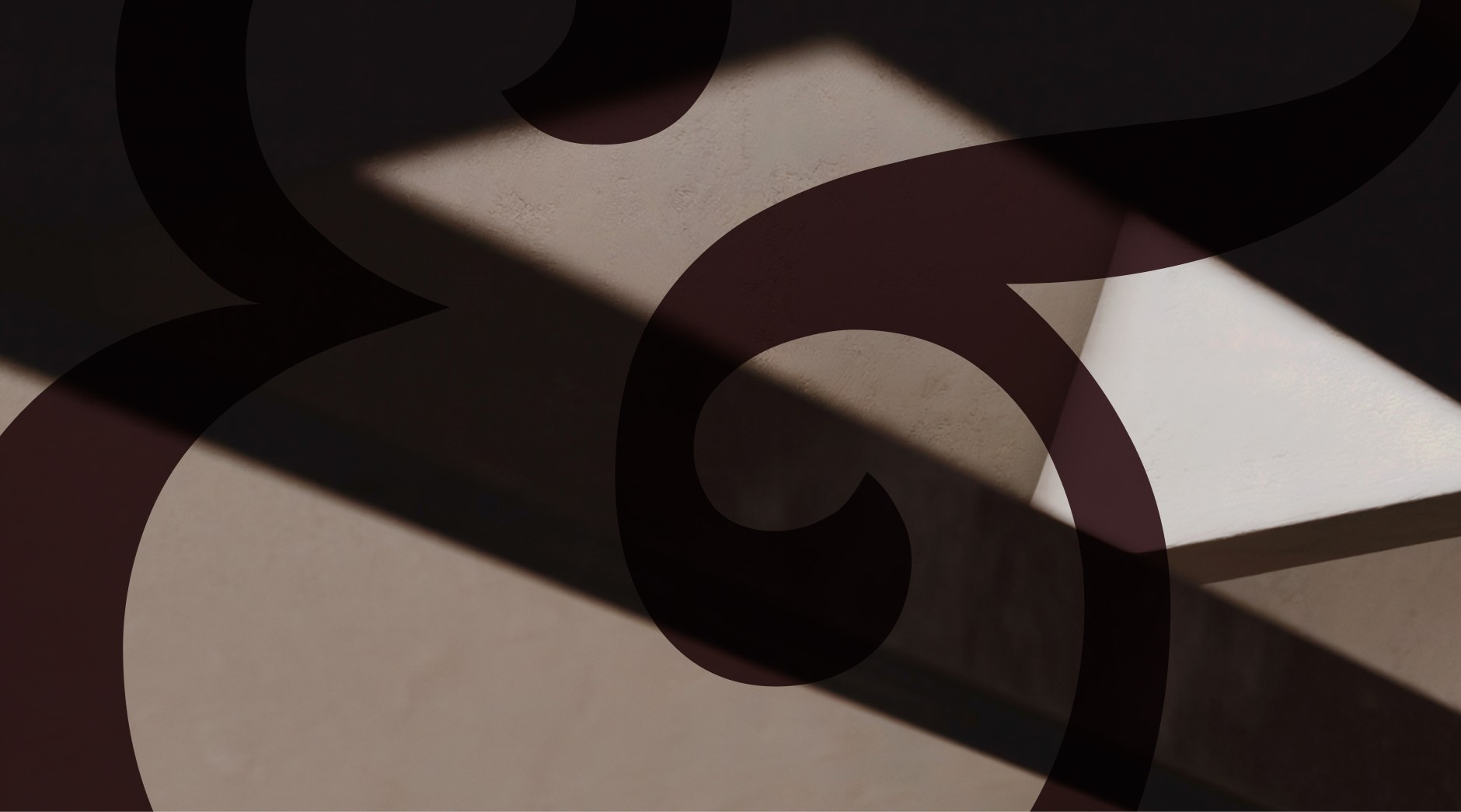
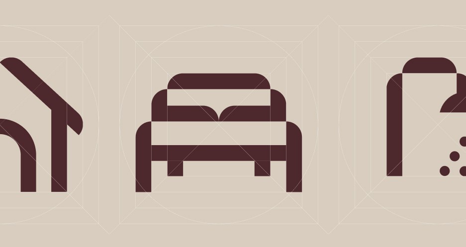
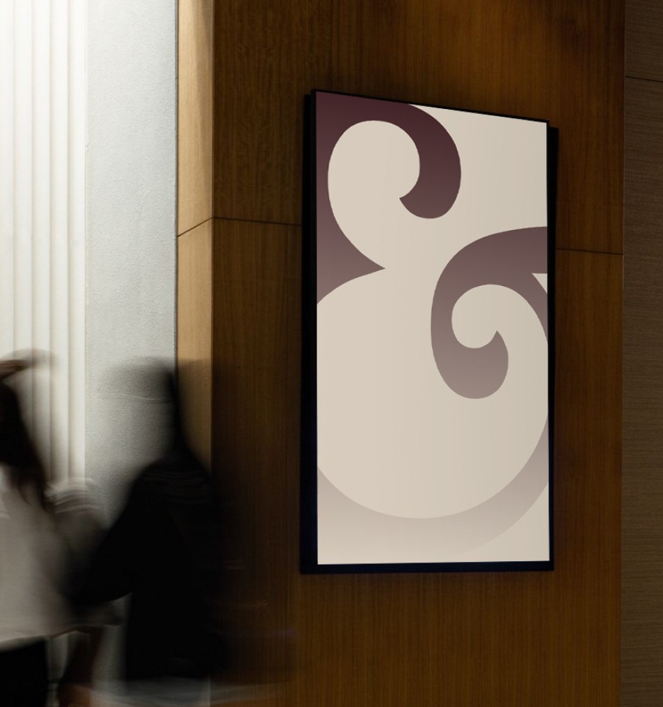
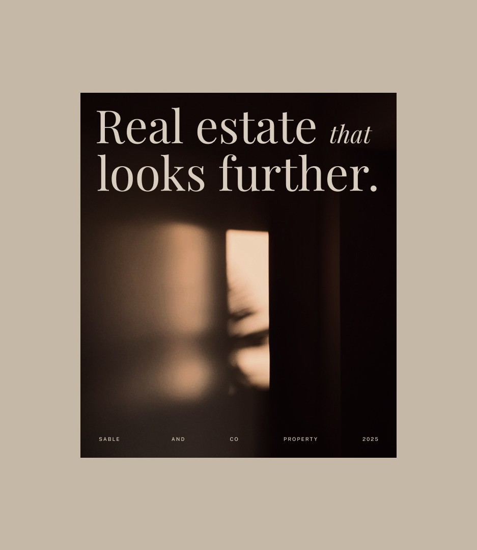
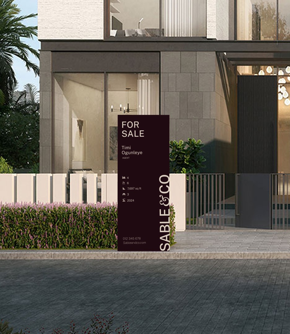
The identity carries through to marketing materials and physical spaces, where its more expressive elements can come forward. That flexibility gives Sable & Co personality without losing the composure expected of a premium property brand.
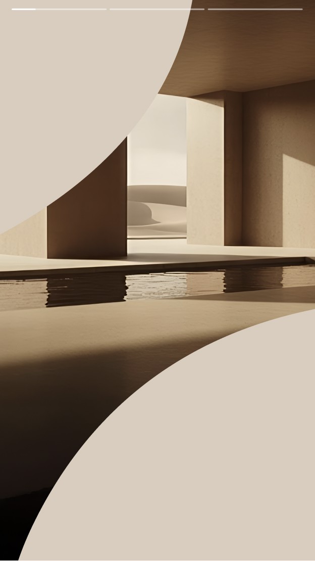
The result feels at home in aspirational settings, but avoids the distance and hard sell often associated with real estate. It presents Sable & Co as confident, approachable and ready to do things differently.